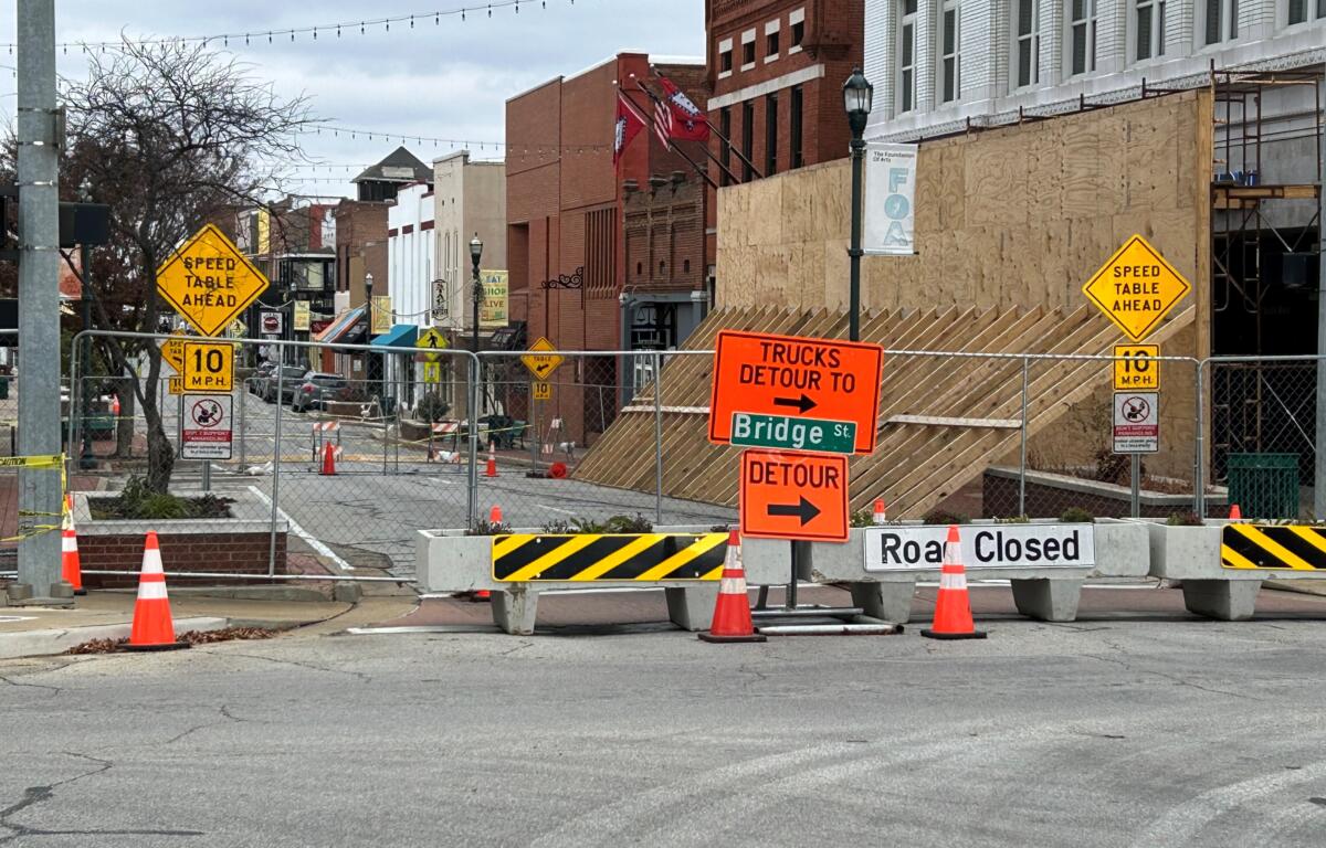

Jonesboro, AR – (JonesboroRightNow.com) – Dec. 11, 2024 – When you approach the intersection of Main Street and Washington Avenue in downtown Jonesboro, you’re given a choice: you can go left or right. You sure can’t go straight, because some piece of the old Citizens Bank building might come loose and fall on you. And I don’t want that.
But my question is this: can the instructions to drivers who already are (or may not be) familiar with the problem not look so chaotic and tacky? The mishmash of street signs looks like overgrown weeds on a property needing to be condemned. It’s a visual hodge-podge…a flea market of signage. I know it’s necessary, but it just doesn’t look prosperous.
I’m no designer, but I know when something looks good and when it doesn’t. That street corner is an annoying reminder of what happens when functionality is prioritized at the expense of aesthetics.
Our current message to citizens is “This is for your protection, but please figure out a way to come patronize our lovely restaurants and businesses downtown.” I agree that’s the right message, but the way we’re sending it is off-putting.
Street signs contribute to the overall impression visitors and residents form about our downtown. Right now, we are sending a message of disorder.
Consistency in signage may seem like a small detail, but it plays a big role in creating a cohesive look. Uniformity in design fosters a sense of order and professionalism. When signs are visually coordinated—with consistent colors, fonts, and sizes—they communicate a message of organization and care.
In contrast, the patchwork of signs downtown undermines the city’s efforts to position itself as a vibrant, forward-thinking hub. It’s hard to admire downtown’s charm when your eyes are assaulted by a riot of signage at the entrance. The visual overload can be confusing to pedestrians and drivers alike.
So, what can be done to address this visual mess? The solution lies in adopting a standardized approach. This doesn’t mean sacrificing functionality for the sake of appearance; it means striking a balance between the two.
The area should look like one person has created the message being given. I know that we don’t want to spend too much time creating something that looks pleasing because surely the need for the signs will go away soon. Judgments will be made; steps will be taken. I’m optimistic that will happen, at some point, but I’m pretty sure it won’t be soon.
It’s already been a mess for three months.
The current state of our downtown signage is an opportunity. It is a chance to show that we take pride in our city and its appearance.
Our city deserves better—and so do we.